The 140th General Assembly approved a recommendation that the “burning bush” and “nec tamen consumebatur” be authorized as an official symbol and motto of The Presbyterian Church in Canada (see 2014 A&P, p. 279). This version of the burning bush, updated in 2018, is used by the national office as a logo for both print and electronic resources and information. The stylized PCC burning bush logo is available for congregations, groups and bodies of The Presbyterian Church in Canada to use for church-related materials, such as church signs, bulletins, websites, newsletters, etc. The logo is also available for collaborative and cooperative ecumenical ventures.
Below are guidelines for the best use of this version of the logo.

Burning Bush – RGB
Hover mouse for more optionsPCC Logo Vertical – RGB
Hover mouse for more optionsPCC Logo 4-Lines – RGB
Hover mouse for more optionsPCC Logo Initials – RGB
Hover mouse for more optionsPCC Logo 1-Line – RGB
Hover mouse for more optionsSpecifications:
Font used — Martel (This font is available from Google Fonts )
CMYK values — Red: C:12 M:100 Y:95 K:2 — Blue: C:100 M:86 Y:28 K:14
RGB values — Red: R:209 G:32 B:43 — Blue: R:30 G:60 B:113
Pantone — Red:Pantone 1795 C, Blue: Pantone 654 C
Presbyterians Sharing Logos
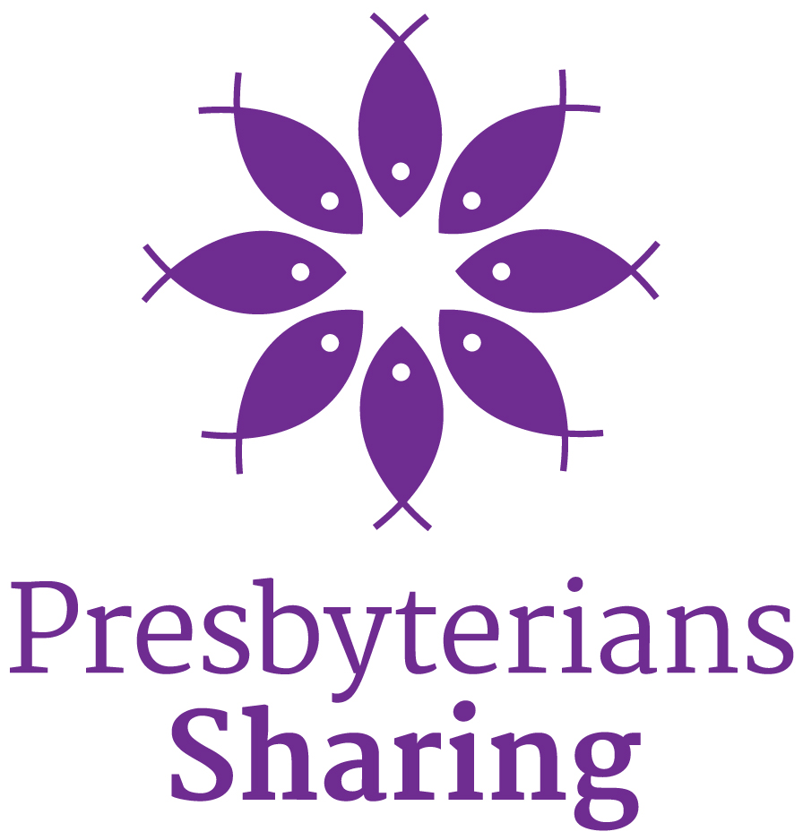
In 2019, the Presbyterians Sharing logo received an update.
The fish was chosen because of the early church’s use of the fish as a symbol of Christ and the Christian faith and church. It also recalls both the miracle of sharing (loaves and fishes) and the commission to be “fishers of people.” There are eight fish, which represent the eight synods in the PCC. Theologically, the number 8 refers to the 8th day (day of resurrection), which invokes the “new creation”—the reconciliation and renewal of all things.
The circle represents gathering, inclusion, unity, wholeness and the perfect everlasting nature of God. The fish are gathered together to signify our working together in collaboration.
The colour purple invokes the colour of majesty and reminds us both of Christ’s rule but also the kingdom we are to build on earth. The design includes two variations of the cross—the Greek cross (+) and the St. Andrew’s cross (x).
Presbyterians Sharing Centre Logo – RGB – Centred
Hover mouse for more options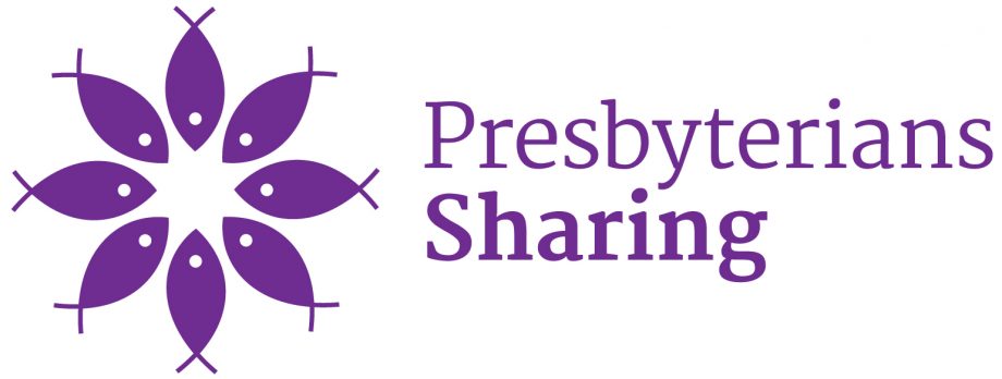
Presbyterians Sharing- Flush Left- RGB- JPEG
Hover mouse for more options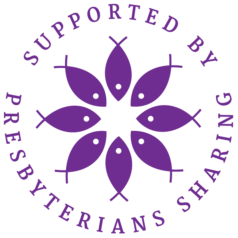
Presbyterians Sharing Logo – Seal – RGB
Hover mouse for more optionsSpecifications:
Font used — Martel (This font is available from Google Fonts )
CMYK values —C: 70 M:98 Y:1 K:0
RGB values — R:111 G:45 B:145
To access other versions of the logo, or to get copies of the logo in different formats, please contact the Communications Office.
Presbyterian World Service & Development (PWS&D) Logos
Presbyterian World Service & Development is the development and relief agency of The Presbyterian Church in Canada. For over 65 years, our church has been actively working to serve marginalized and vulnerable people through Presbyterian World Service & Development. While the global context has evolved since PWS&D was first formed, what has not changed is a commitment to Christ’s message of love through justice, poverty reduction and support in times of disaster.


Specifications:
Font used — Ivy Presto Display
CMYK values —C:88 M:42 Y:69 K:32
RGB values — R:17 G:92 B:78
To access other versions of the logo, or to get copies of the logo in different formats, please contact the Communications Office.